
Help Resources
Menu
The addition of a Menu to your web pages is obviously a standard feature of any website content management system. XPOR enables it in a very simple manner. Menus can be included on templates, fully configured. Alternatively you can add a menu to an existing web page, by changing any of the Atoms on the page to a Menu Atom.
The placement and configuration of Menus on a web page is achieved by means of the Menu Atom. Atoms are placed onto web pages, inside web template "Elements". They are then configured using the options detailed below.
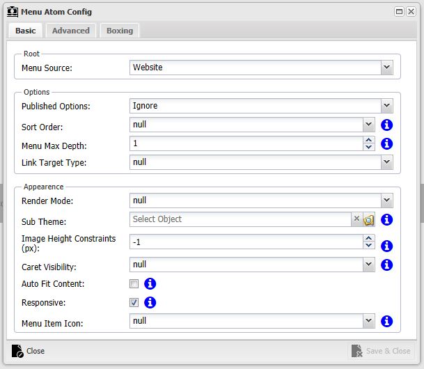
Menu Source
This defines the type of source for the menu. Once selected the contents of that container define the contents of the menu.
- Website
Select this option if you want the menu to display the pages underneath the website that is the parent of the page you are configuring.
- Current Page
Will display the child pages of the Page you are configuring.
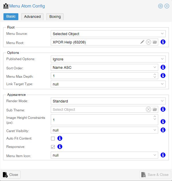
- Selected Object
Allows you to select a specific object from the system to act as the root of the menu, such as a Website Folder or Folder. The Menu will display links to any item that is a child of the Selected Object AND is an Object Type that has the object option set to "Is URLable". In this way, a Menu can provide a menu of "things" that are not just web pages.
As a good example of this, this Help Resource is NOT a web page, it is a Help Resource object type. The Menu used on the web page to access the Help Resources is configured have its' Menu Source as "Selected Object", with the Menu Root selected as the Help Resource folder that contains the Help Resources - and nothing else. The Help Resources are therefore listed as the Menu items. The links that the Menu generates are the URLs taken from the Parent Help Resource Folder (URL Mapping), combined to the Help Resource default URL.
- URL Variable
Allows the menu root to be set as an object that has been passed via the url as a variable. This option changes the contents of a menu when the user has arrived at the web page from a web address which can provide the root of the Menu.
For example, on the Help Resource pages we have TWO menus. The first is "Selected Obect" - as explained above. The second, on the RHS of the page, is configured, as below;
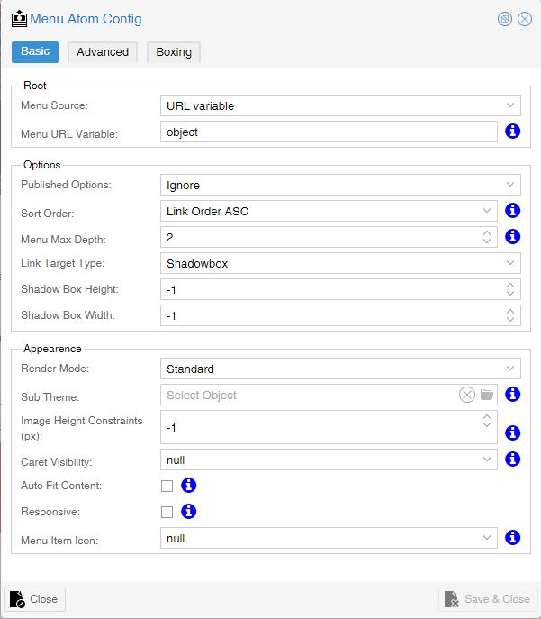
When the User clicks on a menu item in the right hand column, they are taken to a web page, with a URL that XPOR "reads" to work out the web page AND the object it needs to display. So, the URL carries adequate information to the next page, to "understand" what object it should be displaying. This same information can also be used by a Menu Atom as the Root for its' list!
So, by clicking the Help Resource "Making a Website", the next web page will display the "Making a Website" Help Resource AND will use the "Making a Website" Help Resource as the Root for the Right Hand Menu.
Menu URL Variable
This is only visible if you have chosen “URL Variable” from the Menu Source. This is a text field that allows you to type in the name of the variable you are passing. You will need to know the variable name. In every case other than in expert applications it will simply be "object", as shown in the example above. XPOR will therefore use the information it has interrogated from the URL as the "object".
Published Options
Some objects (such as news articles) have the option of “publishing”, which means they become visible on a set date, and can be archived on another date via system scheduling. The statuses for these objects form the options below:
- Unpublished
- Ignore
- Published
- Archived
- Published and Archived
Note that ANY new object types you create can have the option of "Is Publishable", which will mean they will respond to this option.
Menu Root
This is only presented if you have chosen “Selected Object” from the Menu Source. Clicking the open File button opens the XPOR object Browser, enabling you to browse your system and pick the Root for your Menu.
Sort Order
Basic options to allow you to order the menu
- Link Order ASC/DESC - The link order is available to edit when in the back end of the website
- Name ASC/DESC - Alphabetic ordering of the menu items
Menu Max Depth
Allows you to define how many levels you want to display on the menu.
1. The top level
2. The top level and 1 child
3. The top level and 2 child levels etc.
Render Mode
Standard - Renders a responsive, list-based menu based on the amount of levels chosen, based on the “Include in Site Menu(s)” option found on links and pages.
Site Map - Renders a responsive list-based menu based on the amount of levels chosen, based on the “Include in Site Map(s)” option found on links and pages. Can be left un-styled if a standard list of pages is required.
Image Menu - Renders a responsive list-based image menu, based on the “Include in Site Menu(s)” option found on links and pages. It uses the standard object image and renders sizes based on the “Image Height Constraints (px)” field below. It includes the object name under the image.
Mega Menu - In Development
Sub Theme
It is possible that your webpage design has multiple menus on it (a header menu, side menu and footer menu for example). By default the Menu Atom Theme will style all of these identically, which is of no use if you wanted different colours, padding, etc. In this scenario you would create sub themes (please see Atom Themes and Packages) and when setting up an alternately styled menu you can navigate to and select the sub-theme. This will style the menu to that theme rather than the default
Image Height Constrains (px)
Used with Image Menu to limit the size of the image based on its height (the width scales proportionally)
Caret Visibility
If you wish to include a small icon in your menu to show that an Item has "children" then you can configure how deep into your menu that the "caret" is shown.
- Not Visible
- Top Level Only
- Children Only
- All Levels
Auto Fit Content
Not selected by default, this allows you to force the menu to the full width of its containing atom (ticked) or let it expand naturally with the links it contains (not ticked)
Responsive
When the Menu Atom Theme is set up you have an option to select at what level the menu becomes responsive. This check box turns the responsiveness on or off Responsiveness. What is a responsive menu? - A responsive menu is one that changes format to be easier to use on a mobile device. Instead of hover-over links that take up a large amount of space a menu icon replaces these. The menu is navigable in the same structure, but the hover is replaced with a single click. If the user wishes to view a page that has children they would click it, the children would show but the parent page link would be active for a 3 second period so the user could click it again to navigate to it.
Menu Item Icon
A list of icons based on Font Awesome (http://fortawesome.github.io/Font-Awesome/icons/) that can be used as icons in front of each menu link.
Advanced
Custom HTML Repeater
Allows the user to customise what is repeated instead of the standard XPOR5 layout. This option requires an understanding of the Menu’s layout parameters.
XPOR standard repeater (which includes all options for all menus):
- [!ADDBUTTON!]
- <a [!PARAMS!] [!REL!] [!TARGET!] onclick=”" href="[!URL!]" class="[!LEVEL!]">[!OBJECTIMAGE!][!OBJECTNAME!][!CARET!]</a>
- <div style="clear:both"></div>
Key to tags:
[!ADDBUTTON!] - Places the previously mentioned “add” button onto the menu, visible if the CMS Features are turned on.
[!PARAMS!] - Additional parameters required for things like making sure touch compatibility in Internet Explorer works.
[!REL!] - Used as an option for links, if the link target is set to “shadowbox” then a set of code to open the shadowbox is rendered.
[!TARGET!] - Used as an option for links, if the link target is set to “_self” or not set then the target is set to the current page.
[!URL!] - The link to the page you are intending to visit
[!LEVEL!] - A class generated from the name of menu and the level of that menu the link is on. Used for custom styling if required
[!OBJECTIMAGE!] - The object image of the Object. For use with image menus, otherwise it is hidden (not rendered)
[!OBJECTNAME!] - The name of the Object
[!CARET!] - The code that will render the caret into the menu
Menu Alignment
This defines which direction the text within the menus align to.
Menu Location
This defines certain style elements that renders the menu differently.
Top Menu - Horizontal menu with the popups appearing below it
Left Menu - Vertical menu with the popups appearing to the right of it
Bottom Menu - Horizontal menu with the popups appearing above it
Right Menu - Vertical menu with the popups appearing to the left of it
Animations
The popups can be animated when they appear or not, depending on what you configure.
No Animation - The child popup appears instantly
Slide Top - Fades in and slides upwards as it does so
Slide Left - Fades in and slides to the left as it does so
Slide Bottom - Fades in and slides downwards as it does so
Slide Right - Fades in and slides to the right as it does so
Fade - Fades in
Limit to Object Type - Allow you to limit the object type you want to appear in the menu.
Boxing
See help on Atom Boxing