
Help Resources
Buttons on Form Toolbars
XPOR introduces a new and powerful feature to your website creation and management toolkit - Buttons. XPOR provides three means of adding Buttons to your web page Forms.
- Some buttons are added automatically - such as Cancel, Reset, Save etc.
- Other buttons are created automatically depending on what you are doing, if you choose to allow a grid to "Export" for example.
- You can add your own custom Buttons, to process things in your system
This Help Resource is only concerned with the Custom Buttons you can add to perform tasks that you can build and control.
The attached video provides an overview of the process of adding Buttons to forms. To understand Forms you must refer to the separate Help Resource. This Help Resource assumes you already understand Forms
The specific options available for Buttons are explained in more detail in the text below;
What are Buttons?
Buttons are simply ... buttons (!), things you can add onto a form to "do" something. They look like ... buttons and work just like any other button you might see / use on any other piece of software. This Form has a Button (above) that will open the YouTube video.
You can add buttons onto Forms, either at the top or bottom of the Form, in areas we call Toolbars.
Form Toolbars
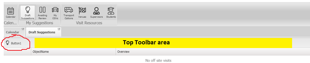
In the image below (of a Form), the Top Toolbar area is highlighted in yellow. This Top Toolbar has a Button in it highlighted in red.
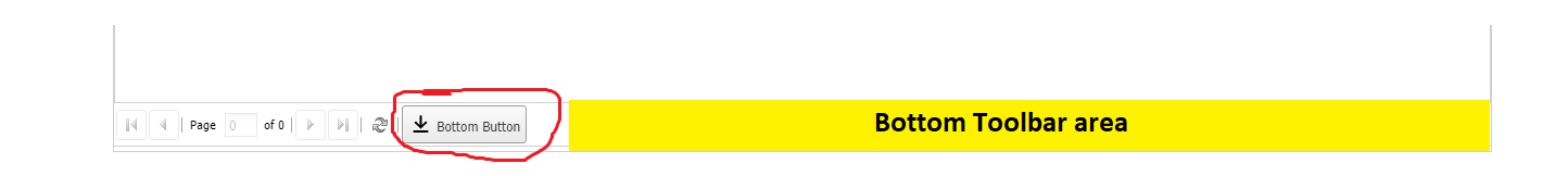
In the image shown below, the Form has a button on its Bottom Toolbar. Bottom Toolbars work in exactly the same way as Top Toolbars. This Help Resource will only feature the Top Toolbar from hereon.
Automatically added Buttons
The Toolbars also display any automatically added Buttons. For example, in the Form shown above, under the "Supporting Categories" we have a Grid Form. This type of Form will allow Add (new record) and Export (csv file), both of which are set in Object Modeller;
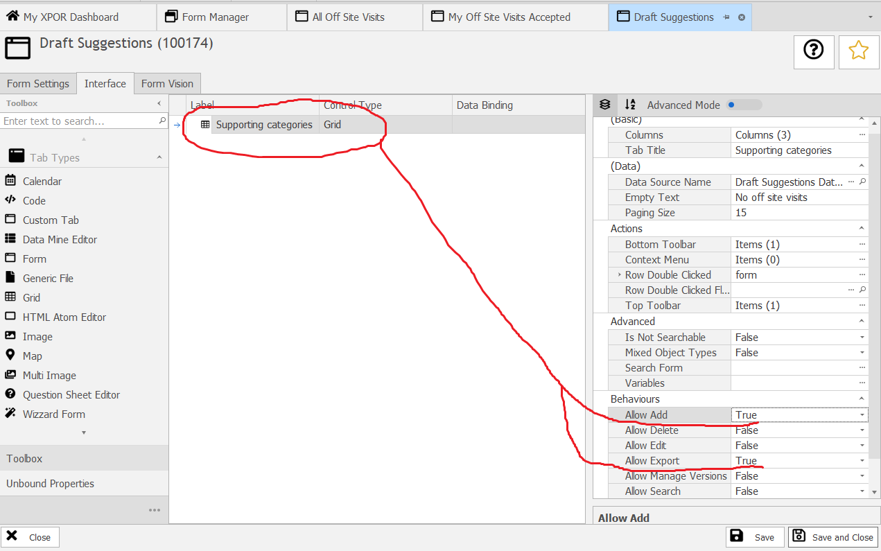
Which we can see on the Form, in its Top Toolbar;
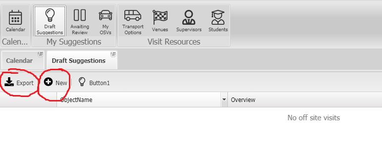
These buttons will perform the pre-configured actions - Export the data in the grid or opening up the object editor form to add a new table record.
Adding Custom Buttons
In the example of the Help Resource object type we looked at above (and in the supporting video), there is a Button under the Help Content tab. This button was added and configured using Object Modeller. It opens the supporting Video, which is running on YouTube.
Buttons are added to Toolbars on Forms. Forms that comprise multiple individual forms will display a Tab for each of the individual forms. The toolbars for each form will need to be configured. In our example, we have a multi-tab form. On the Help Content tab we have one Button, "View" on its' Toolbar. On the Supporting Categories tab, we have three buttons on its' Toolbar - "Export", "Add" and "Category select".
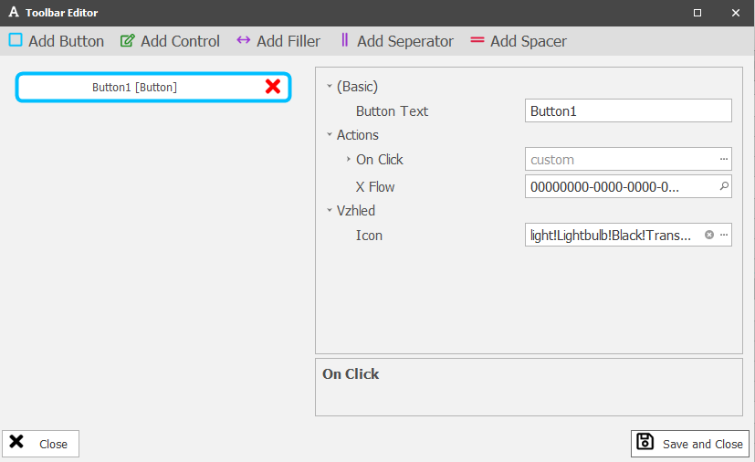
We add Buttons by opening the Toolbar Editor;
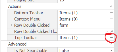
Clicking the three periods opens the Toolbar Editor, which will list out any buttons that are currently on the toolbar, as well as providing the ability to Add New / Remove Buttons;
In fact Buttons are not the only things that can be added to Toolbars. Clicking the drop down arrow next to "Add Button" will list out the things you can add to a Toolbar;
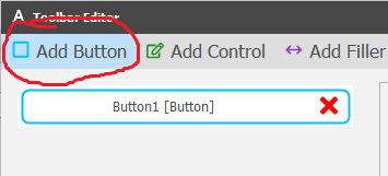
We will Look at each of these options in turn, starting with the Button!
Buttons
Buttons have an "Action Click". This is accessed for configuring from the Toolbar editor (shown above) and clicking the three periods icon. This opens the form below, where you select the Action Type and then configure it:
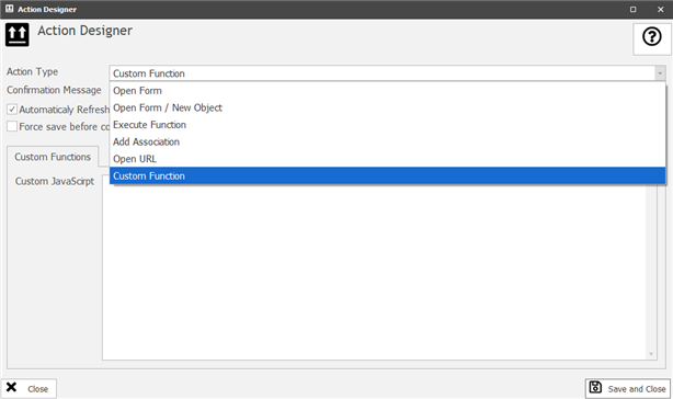
Each of the Action Types is detailed in a Separate Help Resource.
Confirmation Message
Having selected and configured an Action Type, you can add in a "Confirmation Message".
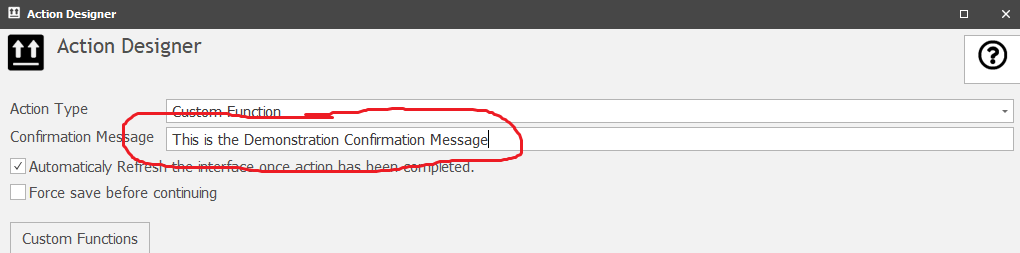
If the Confirmation Message text box is left EMPTY, then the action of clicking the button is executed "when clicked".
If, on the other hand, any text is added to the Confirmation Message, then XPOR will present a Confirmation Box, for the user to read the confirmation message AND choose to Yes (Continue) or No (Cancel);
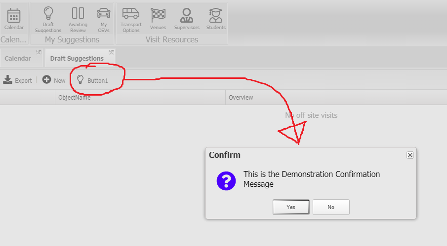
Only if the User clicks the Yes button will the Action be performed.
Automatically Refresh the interface once action has been completed
When changing or adding a property to an object, in response to clicking a button, some actions may benefit (show the results to the user!) from having the underlying interface refreshed. For example, if the action is to add a new entry to a sub table property (list property) of an object, this check box will force the sub table to refresh / display the new entry.
Fore save before continuing
This will force a save of the object that is being worked on, before the User proceeds with any subsequent actions. For example, if the Button Action is to open a form to create a new Object, you will use this to force the object to be saved / associated to its parent, before any other action is completed on the underlying form.
Icon and Text
These options enable you to select an appropriate icon (from the XPOR icon library) and add some text to your Button, to help the User understand the purpose of the Button.
Separator
The Separator is simple a small vertical line, used to put in between Buttons
Filler
The Filler will justify the space used by Buttons. For example, if there are two buttons on a Toolbar, with a Filler between them, the two buttons will display at either end of the form. As the form is resized, the buttons will reposition accordingly.
Spacer
The Spacer has a configuration wher you can set the width of the space. Putting a Spacer between two buttons will introduce a Space of the width set in its' configuration. This is set in Pixels.
Control
Controls can be added to a Toolbar. Controls are the standard XPOR Control set, for example, Date Time Picker, DropDown, Check box etc. These controls must then be configured accordingly.