
Help Resources
Column Types
Grids will display a list of objects from the data source that is bound to the Grid. But a grid is nothing without columns! The Columns on the Grid are used to display specific information about the objects that are being provided by the Data Source. There are eight different types of grid columns, each providing different functionality, explained in this Help Resource.
Having already added a Grid control to your Form and connected it to a source of data (see separate Help Resource), you will now want to add columns to the form. Clicking inside the Columns option box displays an ellipsis "..." icon, which will open the Column Designer box.
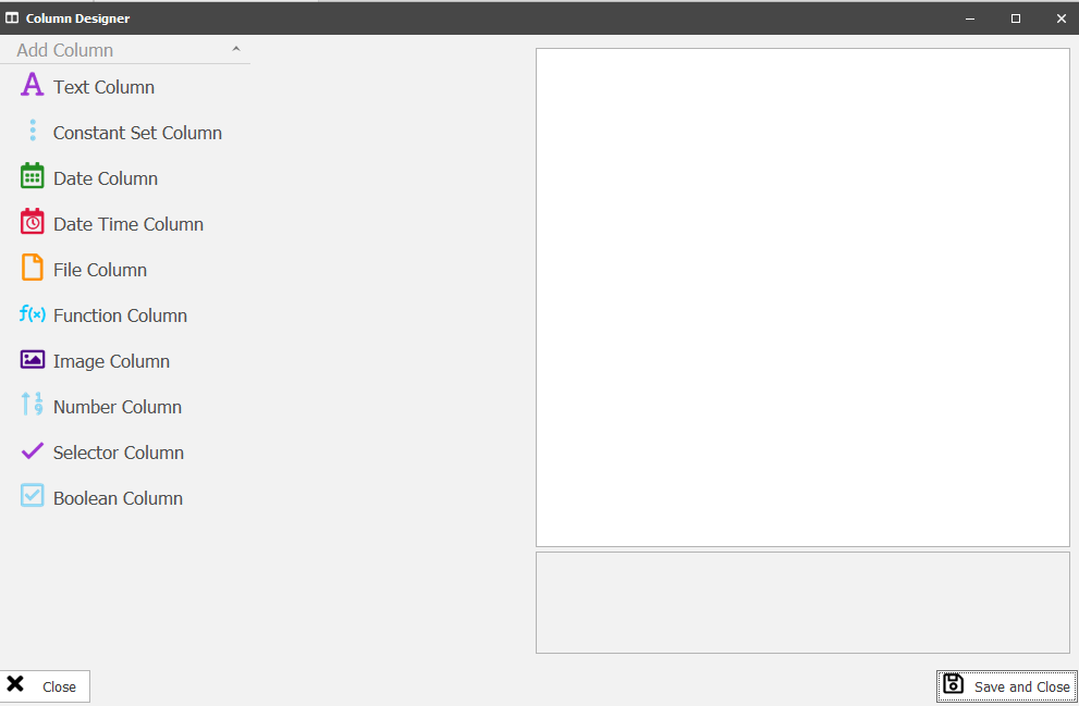
When the column designer is open you can select what type of column you want to add from the drop down, once selected a column of that type will appear on the lefthand side of the designer. When Clicked the righthand side is populated with the configuration for that Column type.
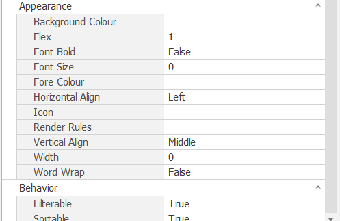
Some of the configuration is the same for all column types these are:
Appearence
Align: The Horizontal Alignment of the data in the column. Left, Center and Right.
Background Colour: The Background color of the Column.
Flex: The ratio size of the column. For example if 3 columns A ,B and C are added with a flex of 1, 2 and 1 respectively then Column a will span 1/4 of the Grid, Column B 2/4 and Column C 1/4.
Font Bold: If True the text will be bold for this column.
Font Size: The size of the text for this column, 0 is the default size.
Fore Color: The colour of the text in the column.
Icon: The Icon that will appear for every row in this column.
Render Rules: For help on render rules please see the relevant help file.
Verticle Align: The Verticle Alignment of the data in the column. Top, Middle, Bottom and Baseline.
Width: The width of the Column in pixels.
Word Wrap: If True the text will go over more than 1 line.
Basic
Text: The header of the Column
Behaviour
Cell Double Clicked: The action that happens when a cell is double clicked in the column. For more help on this see the Action Designer help file.
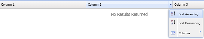
Filterable: If true the column can be filtered, see the image below.
Sortable: If true the column can be sorted, see the image below.
Column Types
Text Column
Text Columns are used to display Text fields.
- DataIndex: The binding for the Column. This is the property of an object that is to be displayed on the column
Image Column
Image Columns are used when an image needs to be rendered that is part of the object. These can't have Icons.
- DataIndex: The binding for the image
- Max Image Size: The max size in pixel for X and Y
- Shadow Image: If True a shadow will be applied behind the image.
Boolean Column
Boolean Columns are used to display a Check or Cross.
- DataIndex: The binding for the Column. Can only choose Boolean Fields.
Date Column
Used to Display Date Fields Formatted Correctly as DD/MM/YYYY. The Filter has also been changed to accomodate dates.
- DataIndex: The binding for the Column. Can only choose Date Fields.
Date Time Column
Used to Display Date Time Fields Formatted Correctly as DD/MM/YYYY MM:HH. The Filter has also been changed to accomodate dates.
- DataIndex: The binding for the Column. Can only choose Date Time Fields.
File Column
Used to render specific fields of a file. Files are stored as JSON files not just file name but, file type and actually file name and file location. When rendered on the text column it would render full blown text, when bound to file fields it just grabs the friendly file name only.
Function Column
There are several types of functions to chose from on function columns. They are as follow:
1. Coalesce - Used to show another value if the first value is empty/nul. Inputs:
Value1: The first Binding.
Value2: The binding for what is displayed if the fist binding is empty.
2. Date Add - Used to show a calculated date. Input:
DatePart: The interval size of the addition. For example Days, Months, Hours etc.
AddValue: The amount of Days, Months Etc that are added to the start date.
Date: The start date for the addition. can be bound to a field on the object or a system date.
3. Date Difference - Used to count the difference between 2 dates. Inputs:
DatePart: The interval size of the difference. For example Hours, Days, Months etc.
StartDate: The start date for the difference. can be bound to a field on the object or a system date.
EndDate: The end date for the difference. can be bound to a field on the object or a system date.
4. Has Association - Used to say if 2 objects are associated, usually if the list of objects are associated to the logged in user or to a certain object. By default True or False will be put into the column but a tick or cross will be shown if "IsBooleanColumn" is set to True. Inputs:
ObjectId: The Object Id of the first object in the association check.
AssociateObjectId: The Object Id of the second object in the association check.
AssociationTypeId: The 6 digit association Type Id of the association type being checked.
ReverseDiection: If 1 (True) then the reverse direction will be checked.
5. Length - used to display the character length of a field.
6. Print Address - Used to display a Address in 1 column instead of using a column for every part of the date. Input:
AddressObjectId: This is the object that you want to display the address fields for.
7. Sub String- Used to display a section of a field from a start point using a length.
Constant Set Column
Constant set columns are special columns that can display the Text, Icon and Colour in the cells that are pre-configured in the Constant Set.
- DataIndex: The binding for the Column. Can only choose Constant Set Fields.
- SetBackground: If True the background of the Cell will be the same as the corresponding colour in the Constant Set.
- ShowIcon: If True the Icon will be the same as the corresponding Icon in the Constant Set.
- ShowText: If True the Text will be the same as the corresponding Text in the Constant Set.